
How to move beyond vanity dashboards by combining quantitative metrics with synthetic research that explains what the numbers actually mean
Your Product Launched Three Weeks Ago. Do You Know What the Numbers Mean?
Your product launched three weeks ago. The numbers are coming in. But do you know what those numbers actually mean?
NPS is 42. Retention at day 7 is 68%. CSAT hovers around 4.1 out of 5. Customer Effort Score looks reasonable. Churn is... well, churn is higher than you'd like, but it's early days. These are the figures your team reviews in the Monday morning stand-up. They nod. They discuss. They move on.
But here is the uncomfortable truth about post-launch metrics: they tell you what happened. They do not tell you why.
A Net Promoter Score of 42 is, by most benchmarks, "good." But good for whom? Good compared to what? And good in which direction? Is it 42 because your core users love the product and your peripheral users are ambivalent? Or is it 42 because everyone is mildly satisfied but nobody is genuinely enthusiastic? These are radically different situations that demand radically different responses, and yet the number on the dashboard is identical.
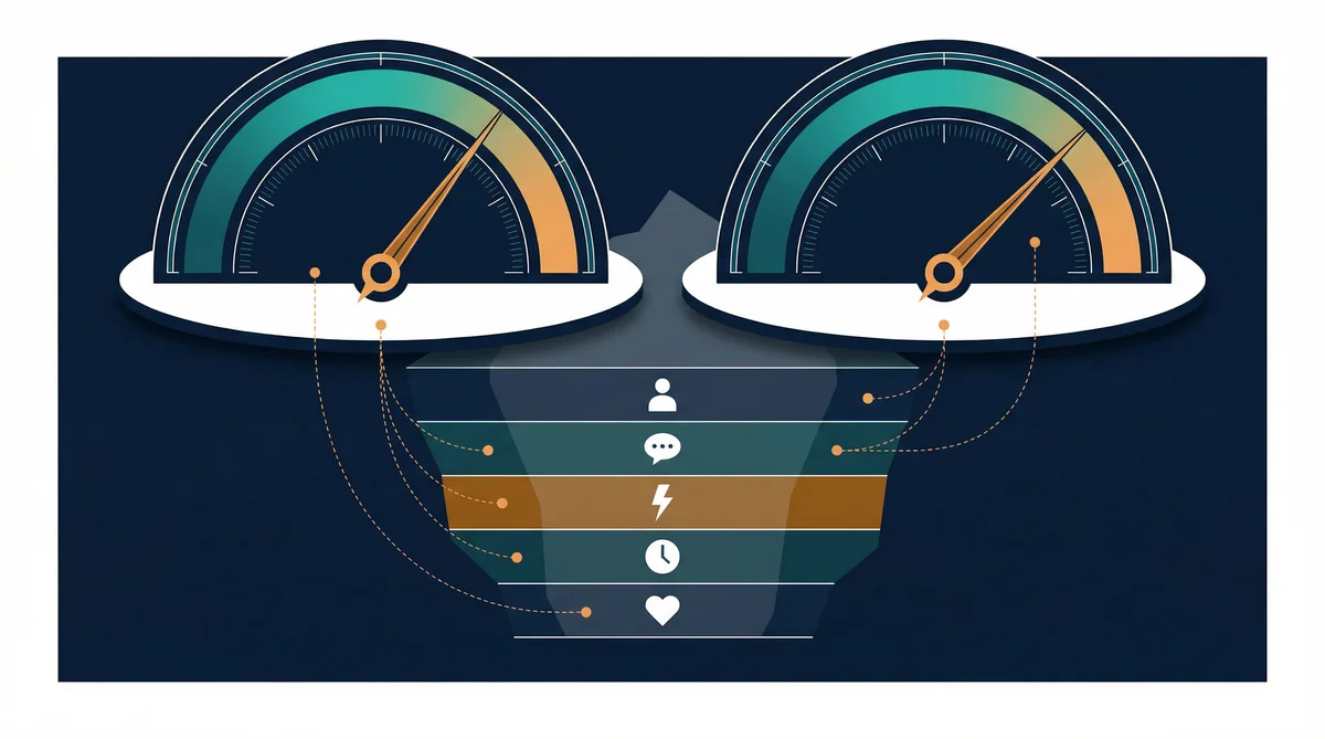
This is the measurement problem that haunts post-launch teams. You have more data than ever and less understanding than you need. Dashboards are green. Growth looks steady. And somewhere beneath the surface, something is going wrong that the numbers cannot articulate.
Post-launch measurement, done properly, is not about collecting more metrics. It is about interrogating the metrics you already have. It is about forcing the numbers to confess what they are hiding.
This article is part of a 9-stage series on product research using Claude Code and FishDog. We are at Stage 8 because measurement without understanding is not measurement at all. It is decoration.
The Quantitative Trap: When Dashboards Become Wallpaper
Product teams have become extraordinarily good at measuring things. The modern analytics stack can track every click, every session, every funnel drop-off, every feature adoption curve. The data warehouse grows. The dashboards multiply. The weekly metrics review becomes a ritual.
And yet.
Products still fail after launch. Users still churn for reasons nobody anticipated. Features that looked promising in the data get abandoned for reasons the data cannot explain. The team that tracked everything understood nothing.
This is what I call the quantitative trap: the belief that if you measure enough things, understanding will follow. It will not. Measurement produces numbers. Understanding requires narrative. And narrative is precisely what quantitative metrics lack.
The Core Post-Launch Metrics
Before we discuss what is missing, let us be clear about what should be measured. These are the standard post-launch metrics and they matter:
Net Promoter Score (NPS): "On a scale of 0-10, how likely are you to recommend this product?" Promoters (9-10) minus Detractors (0-6) gives you a score from -100 to +100. Simple, widely benchmarked, and useful for tracking directional trends.
Customer Satisfaction (CSAT): Typically a 1-5 scale measuring satisfaction with a specific interaction or the product overall. More granular than NPS, more volatile, and more sensitive to recent experience.
Customer Effort Score (CES): "How easy was it to accomplish what you wanted?" A lower-is-better metric that correlates strongly with retention. If using your product feels like work, users will eventually stop working.
Net Revenue Retention (NRR): Revenue from existing customers compared to the same cohort a period ago, including expansion, contraction, and churn. The single best indicator of product-market fit for subscription businesses. Anything above 100% means your existing customers are worth more over time.
Retention Rate: What percentage of users who started using your product on day 1 are still using it on day 7, day 30, day 90? The shape of your retention curve tells you whether you have a product that sticks or a product that leaks.
Churn Rate: The inverse of retention, and the metric that keeps founders awake at night. Monthly churn of 5% sounds manageable until you realise it means losing nearly half your customers in a year.
These metrics are necessary. They are not sufficient.
Where Quantitative Metrics Fail
Consider the following real-world scenarios:
Scenario 1: High CSAT, High Churn. Your customers report being satisfied. They also leave. This is not a contradiction. It is a signal that satisfaction is not enough. Perhaps your product is pleasant but not essential. Perhaps competitors are more convenient. Perhaps the switching cost is low enough that any friction triggers departure. CSAT cannot tell you which of these is true.
Scenario 2: NPS Drops from 45 to 32. Something changed. But what? Did you ship a feature that annoyed power users? Did a competitor launch something better? Did your most recent cohort have different expectations? Did your support response time increase? The NPS decline is real. The cause is invisible.
Scenario 3: Day-30 Retention is 40%, Day-90 Retention is 38%. Users who survive the first month almost all survive the third. This suggests the product delivers value for retained users but fails to convert initial trialists. Why do 60% of users leave in the first month? The retention curve does not say.
In each case, the quantitative metric identifies the symptom. The diagnosis requires something else entirely.
The Missing Layer: Qualitative Intelligence at Scale
Traditional product teams address the quantitative gap with qualitative research: user interviews, support ticket analysis, feedback forms, usability studies. These methods work. They are also slow, expensive, and limited in sample size.
Interviewing 15 churned users takes weeks to schedule, conduct, and synthesise. By the time you understand why users left in January, it is March and the product has changed. The insight arrives too late to prevent the damage it describes.
This is where synthetic research changes the equation.
FishDog provides access to 300,000+ synthetic personas built on census data and behavioural research. These personas can be filtered by demographics, attitudes, and contexts that match your actual user base. They respond to open-ended qualitative questions with the depth and nuance of real interview subjects.
The implications for post-launch measurement are significant. You can now run qualitative research at the speed of quantitative data collection. When NPS drops, you do not wait three weeks to schedule interviews. You run a FishDog study that afternoon. When churn spikes in a specific segment, you recruit synthetic personas matching that segment and ask them why.
This is not a replacement for talking to real users. It is a complement that ensures you are never operating on numbers alone. The dashboard tells you the temperature. FishDog tells you whether the patient has a cold or pneumonia.
The Post-Launch Measurement Framework: Seven Questions That Explain Your Metrics
When quantitative metrics raise questions, FishDog provides answers. The following seven-question framework is designed to run alongside your standard post-launch analytics, translating numbers into narrative.
The 7-Question Post-Launch Study
Question 1: Initial Reaction "You've been using [product] for [timeframe]. What was your initial reaction, and has that changed?"
This captures the gap between first impression and sustained experience. Products that delight on day one but disappoint by day thirty have an onboarding problem masquerading as a product problem. Products that underwhelm initially but grow on users have a marketing problem masquerading as a retention problem.
Question 2: Unmet Expectations "What did you expect [product] to do that it hasn't done? Where has it fallen short of what was promised or implied?"
The expectations gap is invisible in quantitative data. A user who expected feature X and received features A through W is dissatisfied regardless of how good A through W are. This question surfaces the promises your marketing made that your product has not kept.
Question 3: Comparison to Alternatives "How does [product] compare to the other tools or approaches you've used for the same purpose? What does it do better, and what does it do worse?"
Competitive positioning post-launch is different from competitive positioning pre-launch. Before launch, you imagined your differentiation. After launch, users have experienced it. Their comparison is grounded in reality, not marketing.
Question 4: Feature Satisfaction "Which specific features do you use most? Which have you tried and abandoned? Which have you never tried?"
Feature adoption data tells you what users click on. It does not tell you why they click on it, whether they found it useful, or why they stopped. A feature with 80% adoption and 10% regular use is a feature that attracts curiosity but fails to deliver value.
Question 5: Friction Points "Where does [product] feel difficult, confusing, or unnecessarily complicated? What tasks take more effort than they should?"
Customer Effort Score gives you an aggregate friction number. This question gives you a map. It identifies the specific moments where effort exceeds expectation, where the user pauses, frowns, and considers whether this is worth it.
Question 6: Advocacy Likelihood "If a colleague asked you about [product], what would you honestly tell them? What would you praise, and what would you warn them about?"
This is NPS with texture. A score of 7 out of 10 is a "passive" in NPS terminology. But "I'd tell them it's good for X but not Y" is actionable intelligence. The warning is as valuable as the praise, because it tells you exactly what to fix to convert passives into promoters.
Question 7: Improvement Priorities "If you could change three things about [product], what would they be, in order of importance?"
Forced prioritisation reveals what matters most. When users can list everything they dislike, the list is undifferentiated noise. When they must choose three things and rank them, you discover what would actually move the needle.
Why Seven Questions, Not Seventeen
Seven questions may seem insufficient for a comprehensive post-launch assessment. It is not. FishDog's synthetic personas provide rich, narrative responses to each question. Ten personas answering seven open-ended questions produces seventy distinct narrative responses, each several paragraphs long. That is more qualitative data than most teams collect in a month of user interviews.
More questions produce diminishing returns and lower response quality. Seven well-chosen questions, asked of well-matched personas, will explain your metrics better than a forty-question survey ever could.
The Post-Launch Research Cadence: Day 7, Day 30, Day 90
Post-launch measurement is not a single event. It is a cadence. The questions you need answered change as users move through the adoption lifecycle, and your research should change with them.
Day 7: First Impressions and Onboarding Friction
What you are measuring quantitatively: Activation rate, day-1 and day-7 retention, feature adoption breadth, support ticket volume.
What quantitative data cannot tell you: Whether users who activated actually understood the product. Whether users who dropped off were confused, unimpressed, or simply distracted. Whether the onboarding flow created the right mental model.
FishDog study focus: Recruit 10 personas matching your launch cohort demographics. Focus questions on first impression, onboarding experience, and the gap between marketing promise and product reality. Ask specifically about the first five minutes of use.
What to look for: If personas describe confusion about core functionality, your onboarding has a clarity problem. If they describe the product as "fine but not essential," your value proposition has a salience problem. If they describe a specific feature as the reason they would stay, double down on that feature's visibility.
Key question adaptation: Replace Question 3 (comparison to alternatives) with "What almost made you stop using this in the first week?" Early churn is about friction, not competition.
Day 30: Habit Formation and Value Realisation
What you are measuring quantitatively: Day-30 retention, feature adoption depth (not just breadth), NPS baseline, expansion revenue, support ticket themes.
What quantitative data cannot tell you: Whether retained users are genuinely satisfied or merely habituated. Whether the features they use most are the features they value most. Whether the value they have received matches the value they expected.
FishDog study focus: Same demographic profile, new study. Now the questions shift from first impressions to sustained value. Has the product become part of their workflow? What would they miss if it disappeared? What do they wish it did differently now that they understand it better?
What to look for: The transition from "this is interesting" to "this is essential" typically happens around day 30. If personas describe the product as useful but replaceable, you have not yet achieved stickiness. If they describe specific workflows that depend on your product, you are building habit.
Key question adaptation: Replace Question 1 (initial reaction) with "How has your use of this product changed since you started? What do you use it for now that you didn't initially?"
Day 90: Retention Drivers and Churn Risks
What you are measuring quantitatively: Day-90 retention, NRR, churn cohort analysis, CSAT trends, feature deprecation candidates, expansion revenue per account.
What quantitative data cannot tell you: Why users who left actually left. Whether retained users are satisfied or trapped. What would trigger departure among currently loyal users. Whether your product is growing in value or merely persisting through inertia.
FishDog study focus: This is the most consequential study in the cadence. By day 90, early novelty has worn off. Users who remain are either genuinely invested or simply have not found the activation energy to leave. Your study must distinguish between these two groups.
What to look for: Personas who describe the product as "part of how I work" are invested. Personas who describe it as "fine, I suppose" are vulnerable. The gap between these responses is your churn risk. Pay particular attention to Question 7 (improvement priorities) at this stage. Day-90 improvement priorities are the most reliable predictors of future churn.
Key question adaptation: Add a variation of the pre-mortem: "Imagine you stopped using this product next month. What would be the most likely reason?" This surfaces latent dissatisfaction that has not yet manifested in behaviour.
Interpreting the Gap: When Metrics and Narratives Disagree
The most valuable moments in post-launch measurement occur when your quantitative metrics and your qualitative research tell different stories. These disagreements are not errors. They are signals.
High NPS, High Churn
Your promoters love the product. They also leave. This pattern typically indicates one of three things:
Segment mismatch. Your NPS respondents are not representative of your churn cohort. The people who answer NPS surveys tend to be more engaged than the people who quietly cancel. You are measuring the enthusiasm of your fans while your casual users slip away unmeasured.
Value ceiling. Users love what the product does but have extracted its full value. There is nothing more for them here. They are promoters who have graduated, not detractors who are dissatisfied.
External switching. A competitor has launched something that does what you do plus more. Your users still like your product. They just like something else better.
A FishDog study targeting the demographic profile of your churned users (not your retained users) will rapidly identify which of these explanations applies. Ask the seven questions with the framing "you were using [product] but recently stopped." The responses will be more honest than any exit survey.
Low NPS, Low Churn
Your users are not enthusiastic. They also do not leave. This is the product manager's purgatory: a product that is adequate but uninspiring. Users stay because switching costs exceed dissatisfaction, not because they are delighted.
This pattern is dangerous because it looks stable. The metrics suggest a healthy business. The reality is a business that is one competitive shock away from mass departure. When a competitor removes the switching cost or a substitute eliminates the need, the exodus will be sudden and surprising.
A FishDog study here should focus heavily on Question 3 (comparison to alternatives) and Question 7 (improvement priorities). You need to understand what would convert grudging retention into genuine loyalty.
High CSAT, Declining NPS
Users are satisfied with individual interactions but increasingly unlikely to recommend the product overall. This typically indicates accumulated minor frustrations that no single interaction captures. Each support ticket is resolved. Each feature works as described. But the aggregate experience is slowly deteriorating.
Think of it as the difference between restaurant reviews that say "each dish was fine" and reviews that say "the meal was disappointing." The sum can be less than its parts.
A FishDog study at day 90 will surface these accumulated irritations. Question 5 (friction points) and Question 6 (advocacy likelihood with honest warnings) are particularly revealing here.
Using Claude Code to Orchestrate Post-Launch Research
Claude Code transforms post-launch measurement from a manual, periodic exercise into a systematic research programme. The combination of Claude Code's orchestration capabilities and FishDog's synthetic research allows you to maintain continuous qualitative intelligence alongside your quantitative dashboards.
Setting Up the Research Programme
Claude Code can manage the entire post-launch research cadence. Give it your product context, target demographics, and key metrics, and it will:
1. Design Stage-Appropriate Studies
At each milestone (day 7, day 30, day 90), Claude Code creates a FishDog research group matching your user demographics and designs questions tailored to that stage of the adoption lifecycle. The seven-question framework adapts to the relevant concerns at each interval.
2. Execute and Monitor Studies
Claude Code interfaces with FishDog's API to create research groups, submit questions, and poll for completion. A typical study takes minutes, not weeks. Results arrive while the metrics they explain are still current.
3. Synthesise Across Time
The real power emerges when Claude Code compares day-7, day-30, and day-90 studies. How have personas' priorities shifted? What friction points persisted despite product changes? Which improvement requests appeared at day 7 and remain unaddressed at day 90? These longitudinal patterns are invisible in any single study but obvious when Claude Code analyses the series.
4. Generate Metric Explanations
When a specific metric moves, Claude Code can run a targeted FishDog study within hours and deliver a narrative explanation. "NPS dropped 8 points this month. Based on synthetic research with matching personas, the most likely driver is [specific finding]." This turns metric anomalies into actionable intelligence rather than anxious speculation.
Example Prompt for Claude Code
``` My product [name] launched 30 days ago. Here are our current metrics:
NPS: 38 (down from 45 at day 14)
Day-30 retention: 52%
CSAT: 4.0/5
CES: 3.2/5
Monthly churn: 8%
Our target users are [demographic description].
Run a day-30 post-launch study in FishDog with 10 personas matching this demographic. Use the 7-question post-launch framework adapted for the day-30 milestone. I specifically need to understand why NPS is declining while CSAT remains stable.
Compare findings with our day-7 study [reference] and identify trends. ```
Claude Code handles the API calls, monitors study completion, analyses responses against your quantitative data, and delivers a synthesis that explains your metrics in human terms.
Tracking Changes Over Time
The most powerful application of this workflow is longitudinal tracking. Claude Code maintains context across studies, enabling it to identify:
Persistent friction: Issues that appear in every study wave and have not been addressed
Emerging concerns: New themes that were absent at day 7 but prominent at day 30
Resolved issues: Problems from earlier waves that no longer appear (evidence that fixes worked)
Shifting priorities: How users' improvement requests change as they move from novice to experienced
This longitudinal view is nearly impossible to achieve with traditional qualitative research, where each round of interviews starts fresh with different participants and different interviewers. FishDog's consistent persona methodology and Claude Code's synthetic memory create a research continuity that traditional methods cannot match.
Beyond the Dashboard: Building a Measurement Culture That Asks Why
The deepest problem with post-launch measurement is not technical. It is cultural. Most product teams have built cultures around quantitative certainty. Numbers feel authoritative. Dashboards feel conclusive. The green-amber-red traffic light system creates an illusion of understanding that discourages deeper inquiry.
Building a measurement culture that asks "why" requires three shifts:
Shift 1: Treat Every Metric as a Question, Not an Answer
An NPS of 42 is not an answer. It is a question: "42 because of what?" A retention rate of 60% at day 30 is a question: "60% stayed because of what, and 40% left because of what?" The metric is the starting point of inquiry, not its conclusion.
FishDog makes this practical. Every metric anomaly can trigger a targeted study. The cost is measured in minutes and pennies, not weeks and thousands. When inquiry is cheap, curiosity becomes the default.
Shift 2: Measure Narratives, Not Just Numbers
Numbers compress reality into single dimensions. Narratives preserve its complexity. A user who says "I love the core feature but the reporting is so painful that I'm considering alternatives" is a promoter, a detractor, and a churn risk simultaneously. No single number captures this. A narrative does.
Post-launch FishDog studies generate narratives. These narratives should sit alongside dashboards in your weekly review, not in a separate document that nobody reads.
Shift 3: Close the Loop Between Measurement and Action
The purpose of post-launch measurement is not to produce reports. It is to change the product. Every insight that does not lead to a decision is waste. Every metric explanation that does not inform a prioritisation choice is entertainment.
Claude Code's synthesis outputs should feed directly into your product backlog. "Day-30 personas identified onboarding confusion around [feature] as their primary friction point" is a backlog item, not a slide deck finding.
What Good Post-Launch Measurement Looks Like
At the end of a well-executed post-launch measurement programme, you should have:
A quantitative baseline with clear trends across NPS, CSAT, CES, NRR, retention, and churn, measured at consistent intervals.
A qualitative narrative for each metric, explaining not just what the number is but why it is that number and what would change it.
A longitudinal view showing how user perceptions evolve from day 7 through day 90, with persistent issues flagged and resolved issues confirmed.
An action register translating qualitative findings into specific product changes, prioritised by impact on the metrics that matter most.
A predictive model of churn risk, based not on behavioural signals alone but on the narrative reasons users give for potential departure.
This is measurement that earns the name. Not a dashboard. Not a weekly report. A living understanding of what your users experience, what they value, what frustrates them, and what would make them stay or leave.
How This Connects to the Series
Post-launch measurement is Stage 8 because it is the moment where everything you researched in earlier stages meets reality. Your problem framing (Stage 1) predicted a pain point. Your discovery research (Stage 2) explored it. Your segmentation (Stage 3) identified who feels it most. Your concept testing and validation (Stages 7 and 9) confirmed the solution.
Now you find out whether you were right.
The metrics will tell you part of the story. FishDog will tell you the rest. And Claude Code will ensure you never have to choose between speed and depth.
For related research approaches, see brand perception tracking (HT14) for ongoing sentiment measurement, and concept testing (HT13) for pre-launch comparison.
This is article 8 of 9 in the Product Stage series. Previously: Launch. Next: Validation and De-risking.
Ready to understand what your post-launch metrics actually mean? FishDog lets you run qualitative research alongside your quantitative dashboards, turning numbers into narratives in hours. Learn more at fish.dog